sayhello@brightbrightgreat.com
+1 (773) 647-1034
Independent Since 2008
Nav
Start a project
Works
Agency
Contact
WORKS
AGENCY
NEWS
CONTACT
CAREERS
SHHHH
PRIVACY POLICY
Design
Back to all
Mar—24—2026
The Convergence of Human Authenticity, AI-Driven Personalization, and Sensory-Rich Digital Experiences
Dec—16—2025
New Work: GERTRUDE, INC. Branding & Digital Experience
Sep—15—2025
Why Independent Agencies Deliver More Value Than Freelancers or Large Firms
Jul—30—2025
Apprenticeship Recap: Sarah Tanaka
Jan—16—2025
2025 Design Agency State of the Union
Sep—25—2023
Lichter Realty — Digital Experience
Sep—18—2023
Design Summer Sessions Episode 6.1: The 6 Levels of a Designer
Aug—30—2023
Design Summer Sessions Episode 6: Roles & Responsibilities
Aug—21—2023
Design Summer Sessions Episode 5: Value
Aug—15—2023
Design Summer Sessions Episode 4: Fear
Aug—9—2023
How Do I Design in a Foreign Language?
Aug—4—2023
Design Summer Sessions Episode 3: Momentum
Jul—28—2023
Design Summer Sessions Episode 2: Drive
Jul—21—2023
Design Summer Sessions Episode 1: Time
May—22—2023
SafeGuard AI — Strategy, Branding & Digital
May—22—2023
P44 — Marketing & Experiential
Apr—7—2023
The Business Value of Design
Mar—28—2023
Jason Schwartz Speaks at Siebel Center for Design UX Weekend
Jan—19—2023
Bright Bright Great is Listed in Clutch top 1000 for the 4th Year in a Row
Jan—17—2023
Gina Sterling Joins the BBG Design Team
Jun—27—2022
BBG Welcomes Art Director Ka Lee to the Team
Aug—4—2021
An Olympic Feat – KIWI arts GROUP Takes Home Gold and Silver in the Indigo Design Awards 2021
Apr—6—2021
Welcome to the New Bright Bright Great Website
Dec—16—2020
The Best Web Companies in Chicago Digital.com
Mar—3—2020
Job Alert Web & Brand Designer
May—1—2019
New Work: Strong Analytics
Mar—6—2019
Welcome to the Team Greer Mosher, Publication and Brand Designer
Feb—5—2019
BBG is Hiring a Digital Designer
Dec—7—2018
Should I Update WordPress 5.0 and the New Gutenberg Editor?
Feb—15—2018
New Work: Celebrating 100 Years of Color with Rit Dye
Jan—30—2018
New Work: The Landing Hotel, Rivers Casino Hotel Experience
Nov—15—2017
Amy Schwartz listed in Print Magazine New Visual Artist 15 Under 30
Oct—4—2017
Fast Company's Innovation By Design Awards 2017 Winners Announced
Aug—25—2017
Bright Bright Great Added as Certified Design & Development Partner for Big Commerce
Jul—16—2017
Bright Bright Great Welcomes Ken Barrios as Front-End Developer
Jul—12—2017
Bright Bright Great Is Looking for a Design/Photography Apprentice
Jul—6—2017
Bright Bright Great is Looking For A Designer
Jun—16—2017
Bright Bright Great Welcomes Mackenzie Freemire as Art Director
Jun—15—2017
Amy Schwartz Joins Bright Bright Great as Creative Director
May—18—2017
New Work: Hologram, an IoT Company
May—5—2017
New Work: Strata, a Comcast Company
Feb—14—2017
InterOptic by Advantage Optics
Feb—10—2017
Happy 12 Month Anniversary to this Tweet
Jan—27—2017
Bright Bright Great is 10 Years Old!
Oct—10—2016
New Work: Wright & Ditson
Sep—15—2016
New Business: Advantage Optics
Sep—12—2016
New Business: Strata
Aug—17—2016
New Work: Amanecer Yacht
Jul—26—2016
Bright Bright Great Invited to Present at Chicago Innovation Exchange
Jul—13—2016
New Work: Great Lakes Home
Jun—15—2016
New Work: Bright Bright Great Launches New Brand and Website for Red Jacket
Jun—2—2016
New Work: Announcing the New Avondale Type Co Website
May—6—2016
American Needle Redesign Selected as Communication Arts Webpick
May—5—2016
New Work: Triad Process Equipment
Apr—15—2016
New Work: American Needle
Apr—8—2016
New Work: OKRP
Mar—30—2016
Avondale Type Co. Brand Refresh 2016
Mar—14—2016
Bright Bright Great Creative Director Jason Schwartz Named One of Newcity's Design 50 for 2016
Mar—9—2016
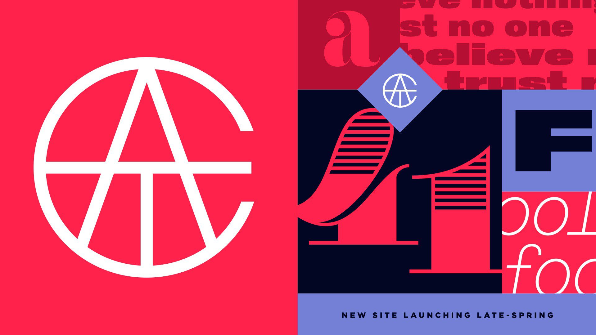
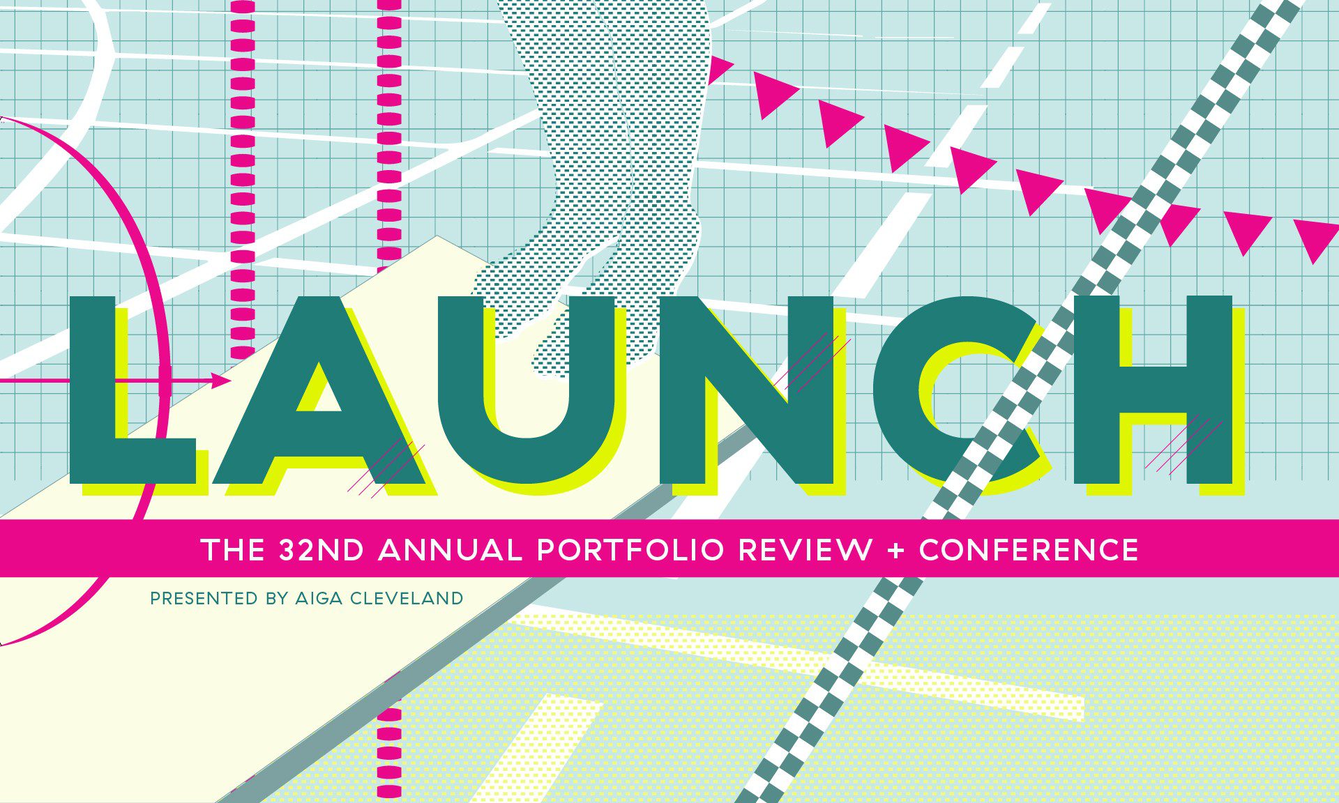
BBG Creative Director Jason Schwartz to Keynote AIGA Cleveland 32nd Annual Conference
Feb—18—2016
Clutch Names Bright Bright Great Top Digital Agency in Chicago
Feb—10—2016
New Work: Geneva Trading
Nov—30—2015
New Work: HighTower Advisors Network "By Invitation Only" Campaign
Oct—14—2015
The Secret Handshake 2015 Recap
Aug—25—2015
Apprenticeship Recap – Dayan D'Aniello
Aug—19—2015
New Music Video For Jennifer Hall's "Make It Out Alive"
Aug—19—2015
Bright Bright Great Announces Creative Partnership with American Needle
Aug—11—2015
New Work: Lichter Realty
Jul—24—2015
Bright Bright Great is Excited to Announce New Creative Partnership with Thyng
Jul—23—2015
Avondale Type Co.'s ATC Ripley Lends Style to K-Swiss' 'The Board' Campaign
Jul—21—2015
Bright Bright Great is Excited to Announce a New Creative Partnership with 4C Insights
Jul—17—2015
A Handy Guide To Working At Bright Bright Great
Jul—10—2015
In The Field – BBG Art Director Jen Hansen Speaks At Liminal Space's "Designing at the Threshold"
Jun—5—2015
Philo Broadcasting Becomes Philo Media
May—28—2015
Assistance League LA – Helping Those Who Help Others
Jan—22—2015
BBG Added As Agency of Record for AIGA Chicago in 2015
Jan—20—2015
Jason Schwartz Speaking At Designation in Chicago, Jan 20 2015
Oct—23—2014
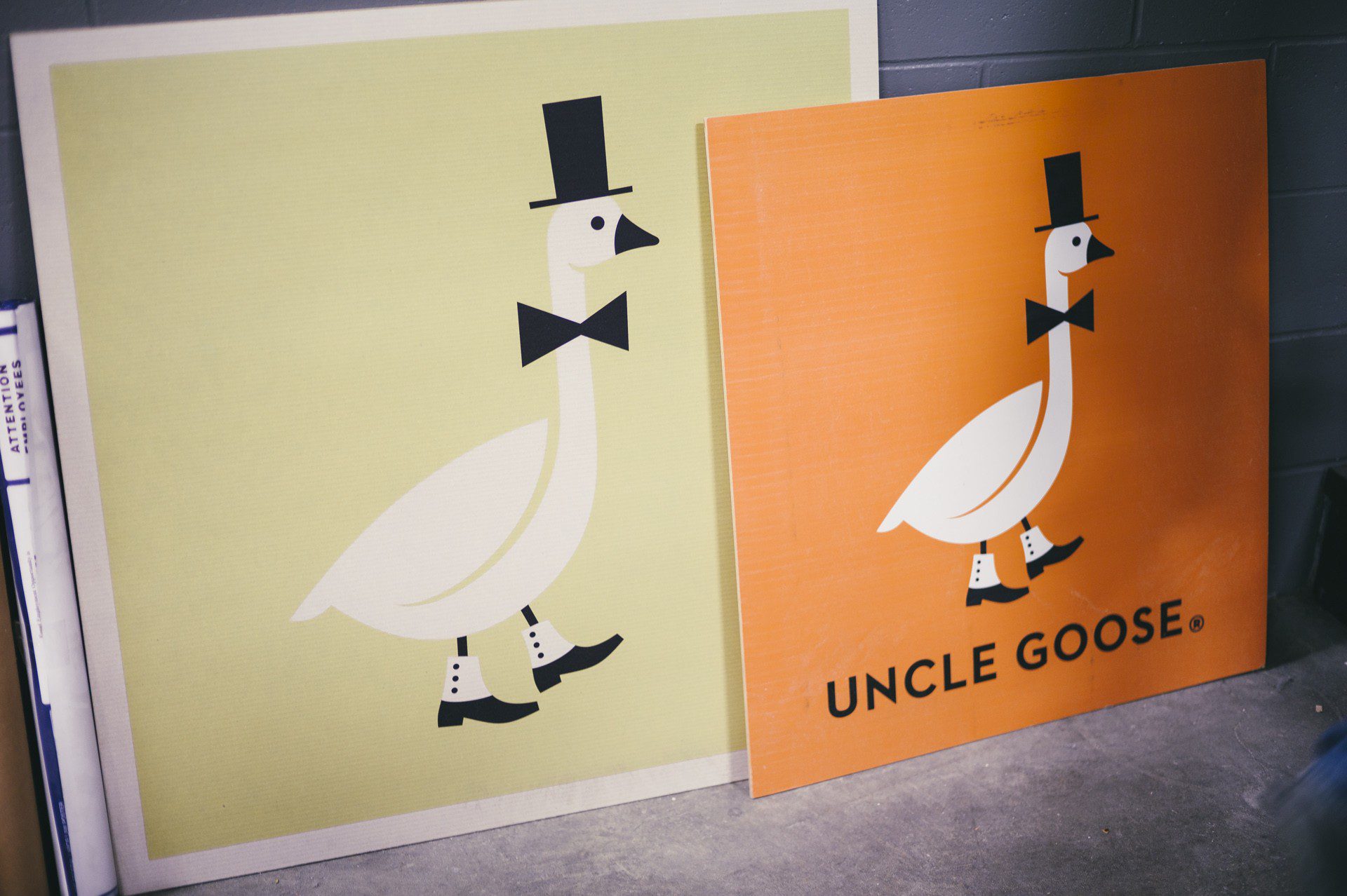
BBG Takes Gold in the 2014 Davey Awards For Our Work on Uncle Goose
Sep—18—2014
Bright Bright Great Named a Clutch 2014 Top Digital Agency
Aug—25—2014
What Does @3x (iPhone 6) Resolution Really Mean?
Aug—1—2014
New Work: Uncle Goose 2.0 – Interactive E-Commerce Experience
Jun—24—2014
The BBG Design Series at Next Door: A Recap of Our First Class
Jun—12—2014
Announcing the BBG Business of Design Series with Next Door Café
Jun—4—2014
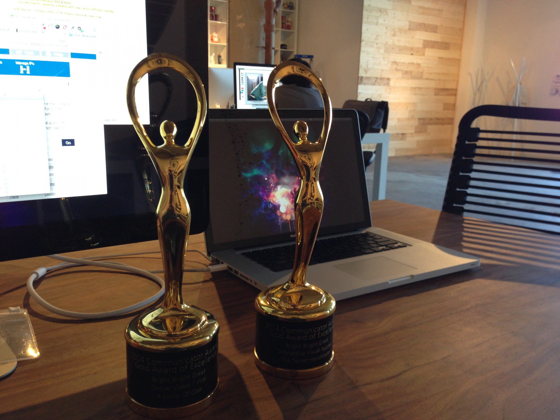
We Did It - BBG Picks Up 2 Communicator Awards of Excellence
May—29—2014
Avondale Type Co. Artist Series 1
Apr—2—2014
BBG visits Uncle Goose Factory in Grand Rapids, Michigan
Mar—26—2014
BBG Under Consideration For Print Only Award
Mar—17—2014
Avondale Type Co Rosemary Screen print
Mar—10—2014
BBG is Excited To Announce ATC Overlook The New Workhorse Sans Serif On Avondale Type Co.
Mar—3—2014
Bright Bright Great Welcomes Brand Strategists Juliette David & Marie Charzat To The Team
Jan—30—2014
BBG's Jason Schwartz on Jobs & Portfolios for The College of St. Rose
Jan—28—2014
New Work: Holiday Bullshit by Cards Against Humanity
Dec—13—2013
ATC Screen Printing
Oct—21—2013
New Work: ARE + Black Spectacles
Oct—21—2013
The Museum Of Science and Industry Present the Treasures Of Walt Disney Exhibition
Oct—21—2013
Help Us Name The Secret Handshake & Form + Future Conference 2014
Oct—1—2013
New Office Art – Kyle LaMere Photography Ribbons Series, 2013
Sep—26—2013
Avondale Type Co Fonts Now Available On You Work For Them
Sep—20—2013
LIMITED EDITION BBG TEE PREORDER – 10 PEOPLE TO MAKE IT HAPPEN
Sep—11—2013
Venture Beat - The 4 Dangers Of Hiring A Web Designer + Response
Sep—11—2013
Announcing Avondale Type Co., A New Font Foundry by BBG
Aug—23—2013
BBG at WMC Fest, Cleveland, OH
Apr—25—2013
Bright Bright Great Featured on AIGA Member Gallery
Feb—22—2013
Behind The Scenes: Stock & Airbrush
Nov—30—2012
New Work: Paperlet
Oct—27—2012
BBG Is Proud To Announce Our 3rd 2 Night Stand Event
Oct—10—2012
New Work: Argo Tea Mobile Web Experience
Aug—3—2012
Our 1st Ice Cream Social Was A Mega Hit
Mar—29—2012
Fresh Impressions On Brandmarks
Feb—1—2012
Dieter Rams' 10 Principles for Good Design & Why It's Still Relevant